Manual: Features-Responsive |
|
| Get Started |Calendar |Locations |
Feature=Responsive implements logic and an approach that permits the site to "respond to" or resize itself depending on the Visitor's screen size and orientation. A general overview of the approach taken to adapt a RidgeStar site's Page Design is available at Manual: Usage-Responsive.
Feature=Responsive redefines the CSS Style Sheet for a RidgeStar Site to define three different "break points" completely based upon the width of the Device or Window that is operating the Browser. They are identified as Large (over 1007 pixels), Medium (between 640 and 1007 pixels), and Small (under 640 pixels wide). These break points or values may be different for your site (for sites with Feature=Responsive active)
[Webmasters] working in support of a User base may find the following things quite useful.
- Resizing a Desktop Browser
- If you are operating on a Medium or Large device (e.g. a Desktop) and you use your mouse to re-size the Browser Window to under 640 pixels in width, you'll be able to see the Website "respond" and change the presentation to the Small style.
- Chrome Developer Tools
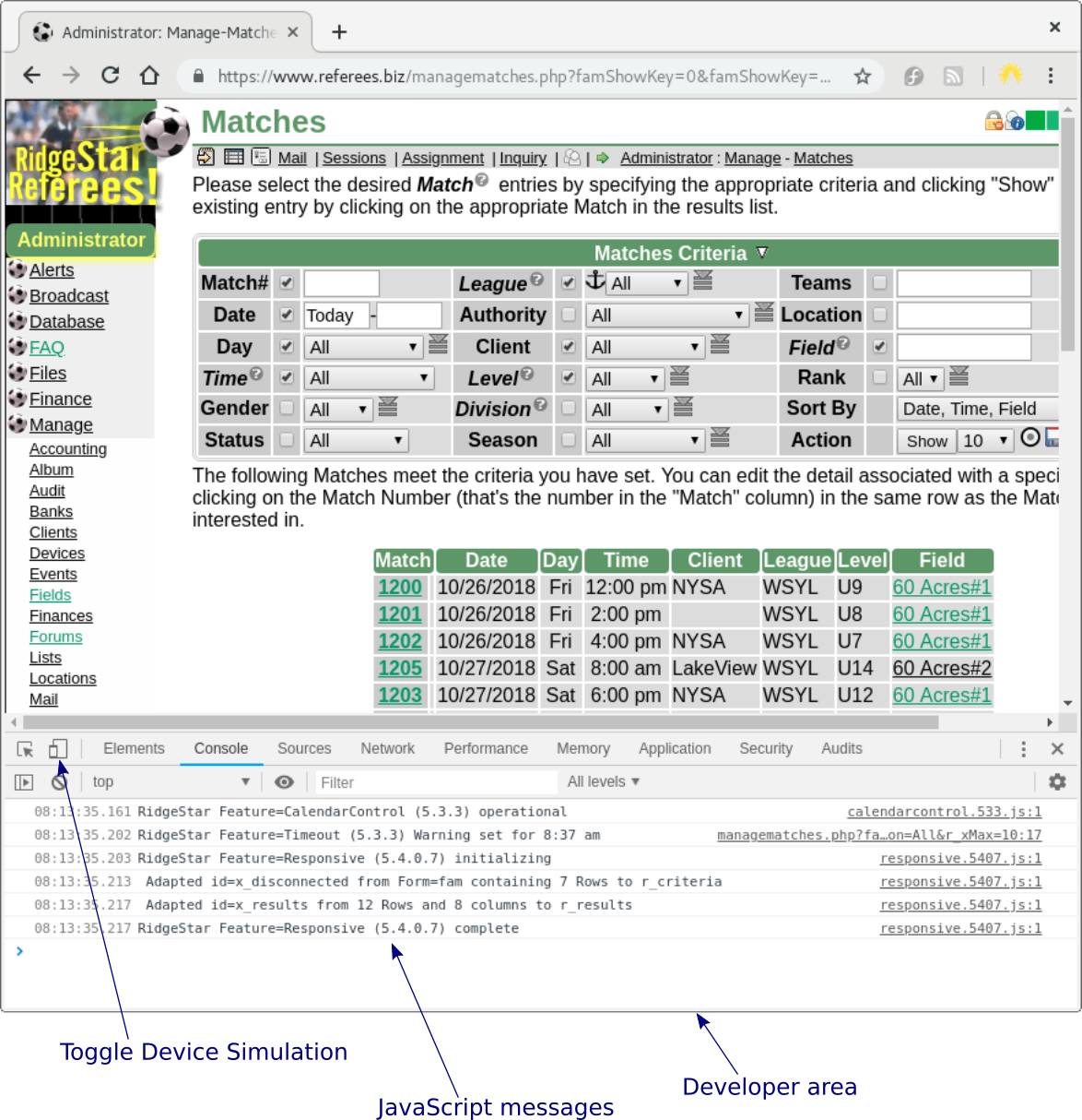
- If you're operating Chrome, you can activate the Developer Tools (usually, F12) to open the Developer window, which will look similiar to this:

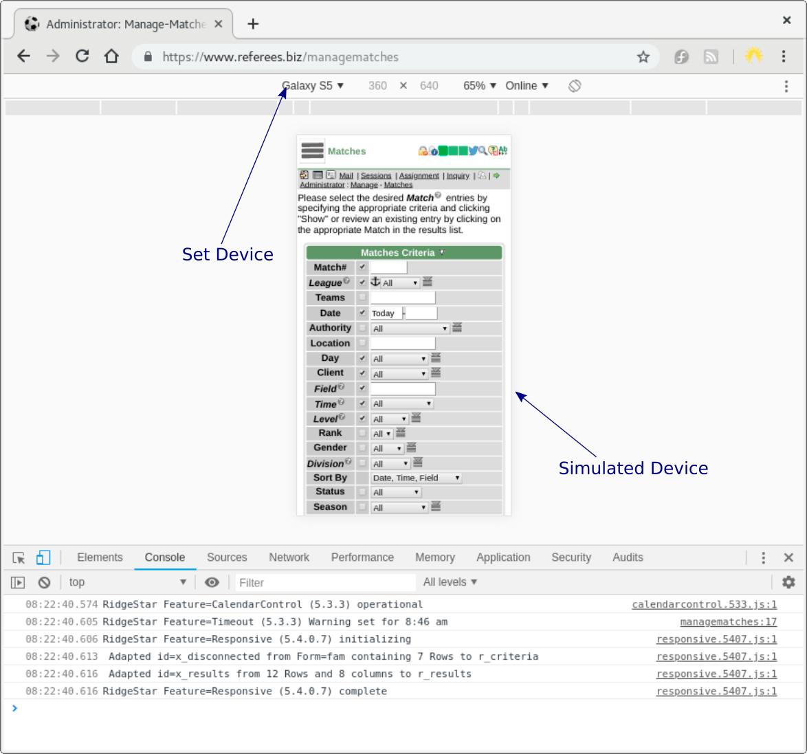
Click the Toggle Device Simulation symbol to change the top of the Window from a desktop style to a similated mobile device, which will appear similar to this:

You can change the simulated Device at the top of the page, which can be quite handy when attempting to replicate a User's experience and how the website is responding to and formating for the Small Device.
- FireFox Web Developer Tools
- FireFox has very similar Web Developer tools (usually, F12), then clicking the "Responsive Design Mode" symbol at the top right edge of the Web Developer header (just before the close action).
| Copyright © 2024 by RidgeStar/webmaster@ridgestar.com |
