Manual: Construction-Look and Feel |
|
| Get Started |Calendar |Locations |
Each Client![]() has slightly different desires as to how their site should look and we are happy to accommodate those desires!
has slightly different desires as to how their site should look and we are happy to accommodate those desires!
Basic Browser Layout
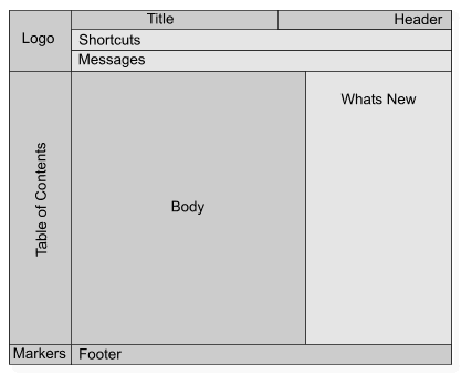
After starting construction on your Site, RidgeStar immediatley creates one or more options for your Site's "Look and Feel". This helps us to establish the colors, logos, and layout. For the typical Referee Management Site![]() , the Site is normally laid out as follows:
, the Site is normally laid out as follows:

- Logo
- Displays your Chapter's Logo or an image that represents your Chapter
- Table of Contents
- Contains the Segments, Areas, and SubAreas that organize the elements available on your Site
- Title
- Identifies the short name for the page
- Body
- Contains information that varies from page to page.
- Footer
- Displays the your Chapter's copyright statement and indicates the end of the page
At RidgeStar, we feel that every page on your Site should contain these elements: It provides a consistent format for your Visitors and makes it simple to move to around the Site (any page on the Site is usually no more than 2 or 3 clicks from another page).
Site Prototypes
After we launch into Site construction, we'll ask for your Logo and preferred colors. This allows us to provide you with one or more Site "Prototypes", which are graphics that represent your Site's combination of colors and graphics. We then use your suggestions and ideas until you get something that you like.
We recommend the following color guidelines:
- Pick a Primary color. For example, the primary color for RidgeStar is the Blue that appears on the page headings (titles) and buttons.
- Pick an Accent color. For example, the secondary color for RidgeStar is the Yellow that appears in the Logo and in the Table of Contents. (Normally, the Accent color should provide a suitable contrast to the Primary.)
- Pick a Background color. For example, the background color for RidgeStar is a light gray, which provides a visual separation for page segments and tables. (Gray is a common background color because it is generally a neutral to the human eye.)
I don't like that color!
Please remember that your SiteManager, not RidgeStar, picks the color combinations on your Site. Also, remember that color preference is subjective: one person's "favorite green" is the next person's "horrible green". If you don't like the colors on your old Site, we encourage you to methodically solicit input from other organizational members before we make changes! It's sometimes quite surprising what the "other" people suggest...
| Copyright © 2024 by RidgeStar/webmaster@ridgestar.com |
